
Making a mortgage pipeline easier to act on
Staircase is a B2B fintech platform for mortgage lenders and brokers to manage loan pipelines and borrower status. I designed the core operations dashboard and mobile experience, focusing on a practical problem: helping loan officers see what needs attention without losing access to the detail behind each deal.
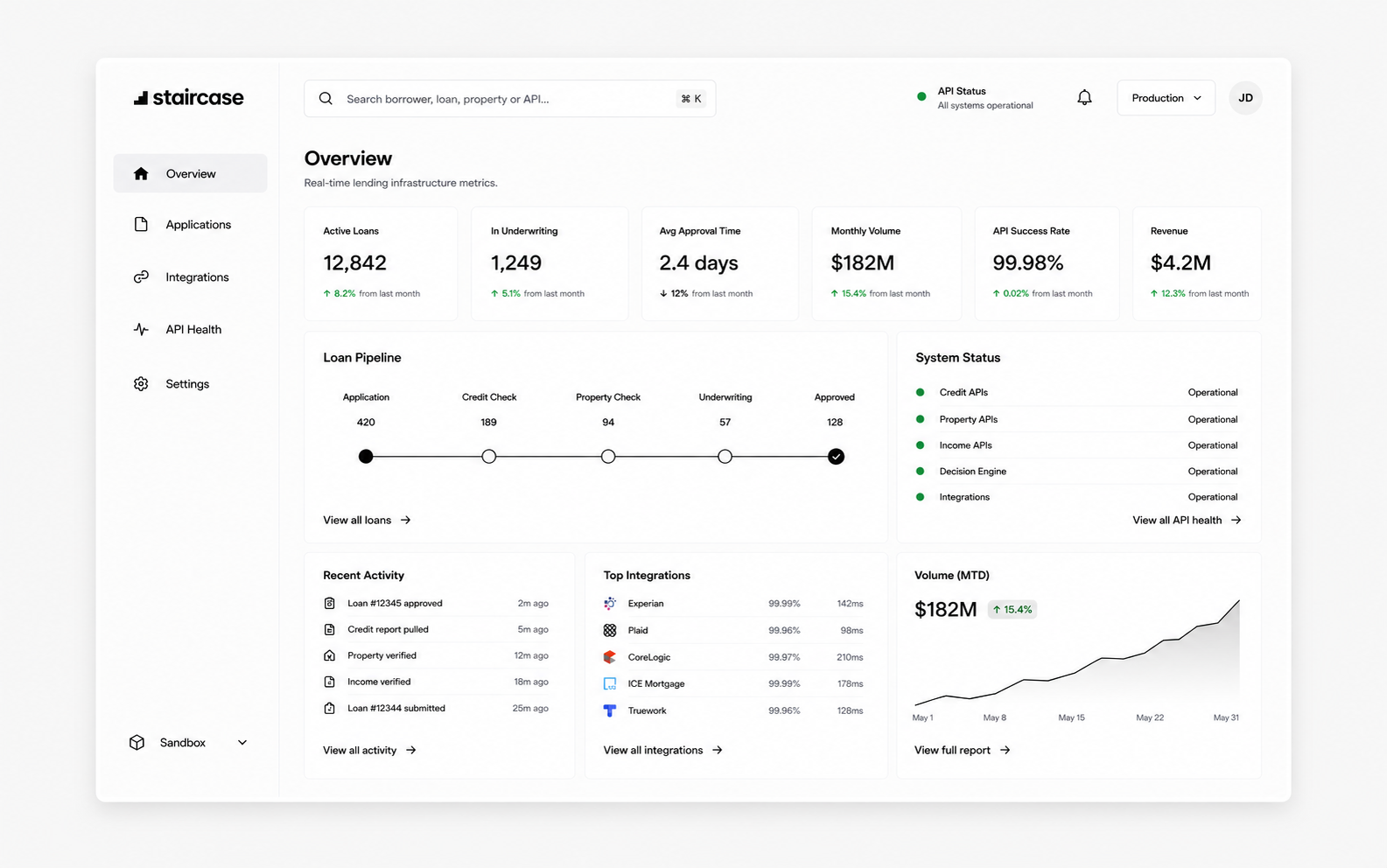
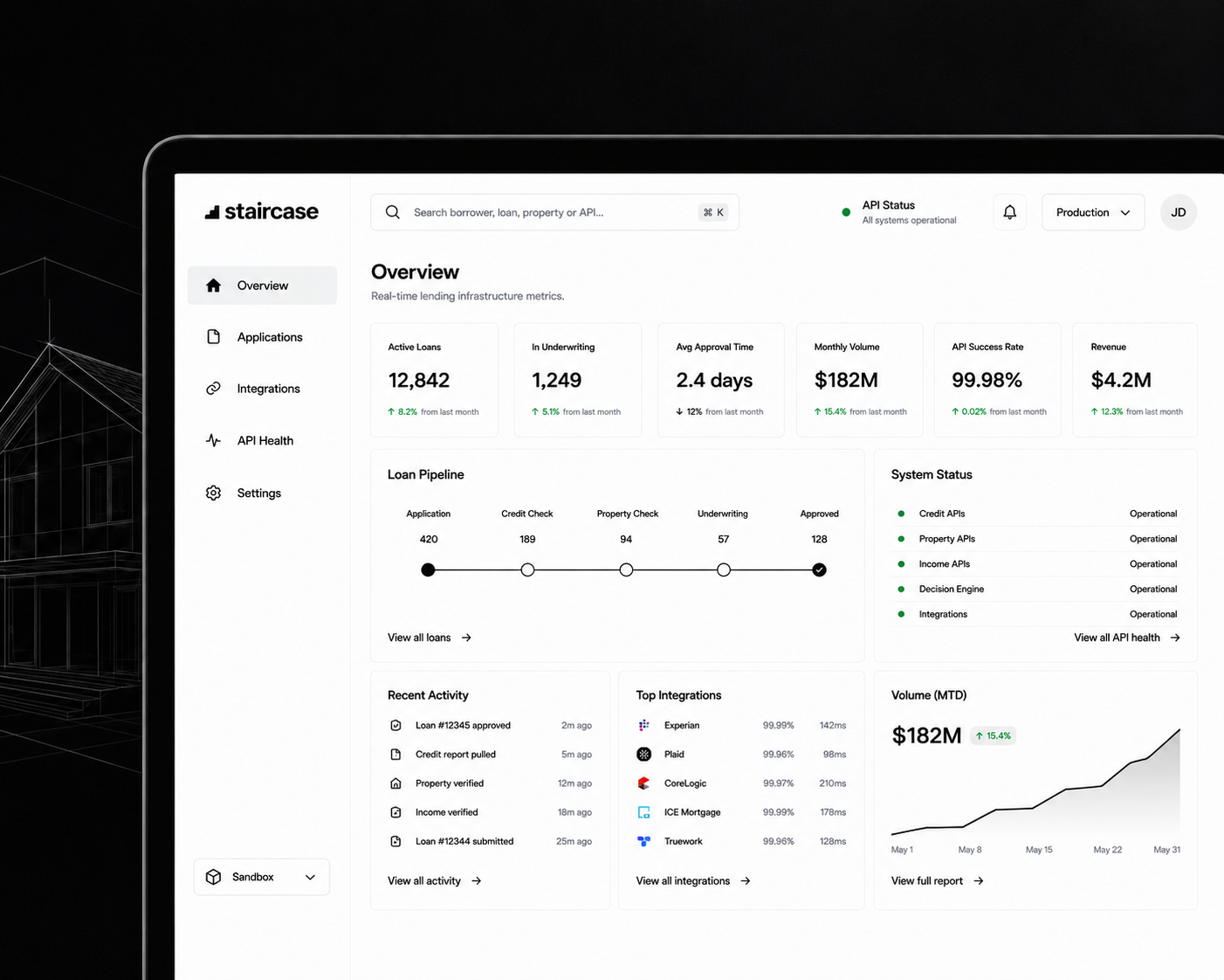
The dashboard had to show a lot of financial information without making every number compete for attention. I focused on making the pipeline easier to scan, prioritizing urgent work and preserving access to the underlying details.
What got in the way
Interviews with loan officers and operations teams pointed to three recurring sources of friction.
No at-a-glance pipeline view
Approval rate, conversion and outstanding volume were spread across screens, so understanding the pipeline required leaving the task at hand.
Data without hierarchy
Urgent items looked like routine entries. Without a clear hierarchy, loan officers had to scan the same rows repeatedly to identify what needed action.
Mobile was an afterthought
The desktop layout did not support quick status checks or alert responses when loan officers were away from their desks.
The decisions
Command center dashboard
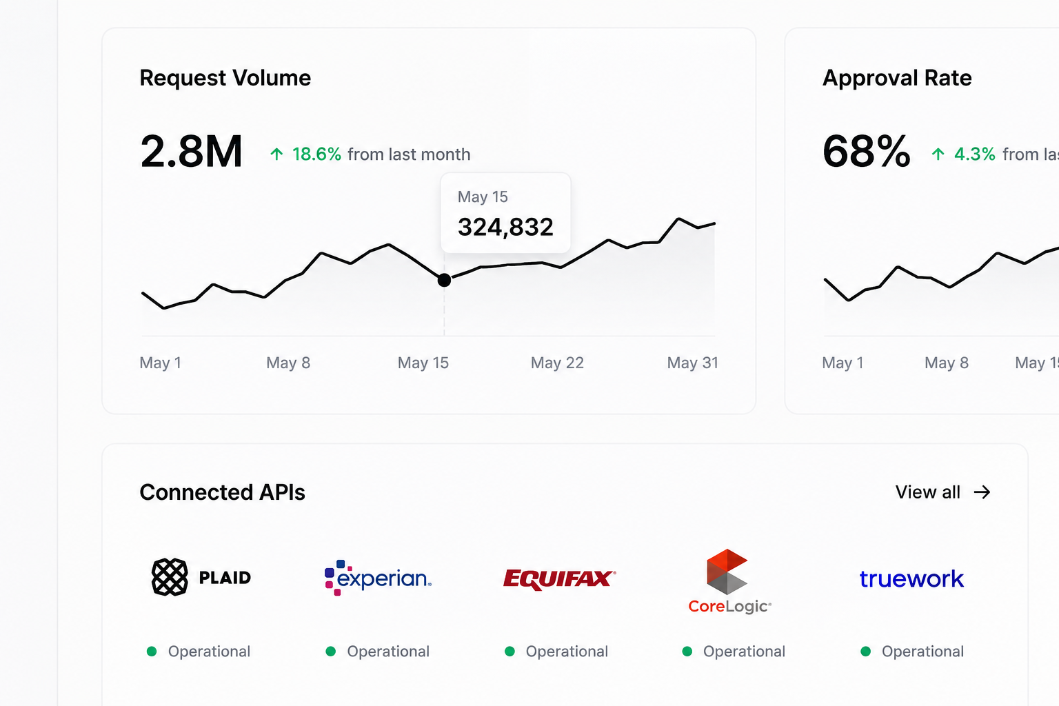
I brought request volume, approval rate, conversion and outstanding balance into a summary visible before scrolling. The tradeoff was to surface a small set of decision-making signals first while keeping detailed pipeline information available below.
Status-driven data tables
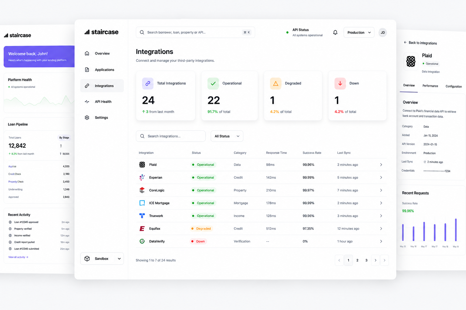
I used status indicators and priority sorting to distinguish items that need attention from routine work. The goal was not to hide data, but to make the next action easier to spot.
Mobile-first field experience
I designed a dedicated mobile view around field tasks: checking loan status, reviewing borrower details and responding to alerts without carrying the full desktop information density onto a small screen.
Dashboard & pipeline
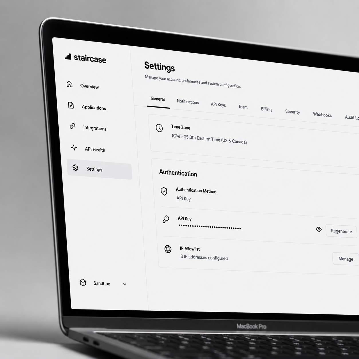
The dashboard starts with a compact summary of total requests, approval rate, conversion and outstanding volume. Below it, status and priority cues help loan officers identify the records that need attention first, while preserving the pipeline detail required for follow-up.
Mobile experience
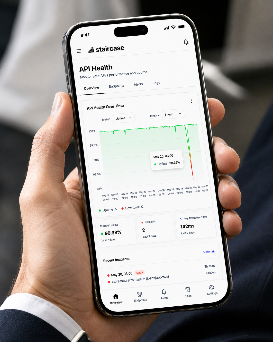
The mobile view prioritizes quick checks and responses rather than reproducing the entire desktop dashboard. Loan officers can check an active deal, review borrower details and respond to alerts with less navigation.
What changed
The redesign focused on making pipeline status easier to find and routine decisions easier to make without moving between screens. The metrics below capture reported task completion, pipeline volume and mobile engagement during the engagement period.
Task completion measured via usability testing against the previous interface. Pipeline volume reflects platform scale during the engagement period.
Thank you for viewing!