Argentina’s roads, redesigned for the people who drive them
Ruta0 is Argentina's most established road travel platform, active since 1999. It helps millions of travellers calculate routes and distances, check real-time road conditions reported by the community, and find accommodation across the country. I led the UX/UI redesign of the core web and mobile experience, modernizing a product with deep roots and an audience that trusts it completely.
Ruta0 has been helping Argentines plan road trips for over 25 years. My job was making that trust feel modern without losing a single thing that made it earned.
Problems
A platform built over 25 years accumulates layers. User research and analytics pointed to three problems that were limiting engagement across the board.
Outdated visual language
The interface carried years of incremental patches. The information was reliable but the experience felt dated, eroding trust with a new generation of travellers who compared it against modern apps.
Search was the only entry point
Most users arrived knowing their origin and destination. But a large share wanted to explore, and the platform had no clear path for discovery beyond the search box.
Mobile was a scaled-down afterthought
Road travel is inherently mobile. The existing experience shrank the desktop into a small screen without rethinking the use case: someone checking conditions or finding accommodation mid-trip.
Solutions
Modern design, familiar structure
Refreshed the visual system with a clean typographic hierarchy, updated color palette and a layout that respects the information density users expect without overwhelming them.
Discovery alongside search
Added destination and region browsing as first-class entry points, giving exploratory users a way in that felt as natural as typing a route. Community activity and road alerts surface contextually.
Mobile built for the road
Redesigned the mobile experience around real travel moments: checking road status, finding a place to stay nearby, or pulling up a route without hunting through menus.
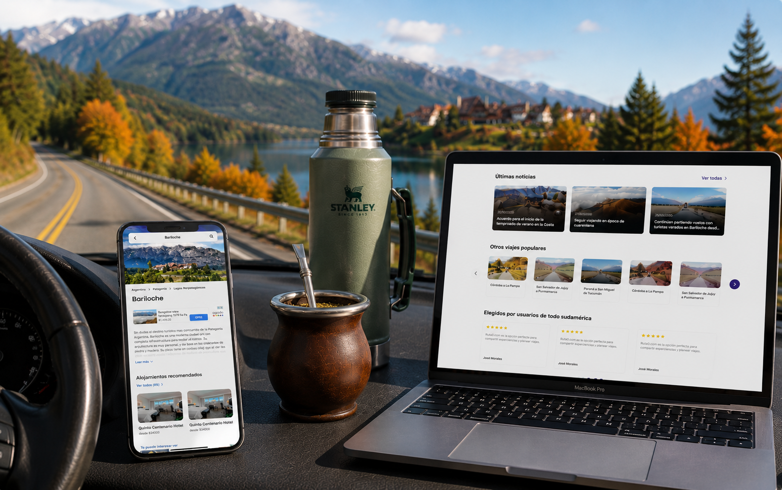
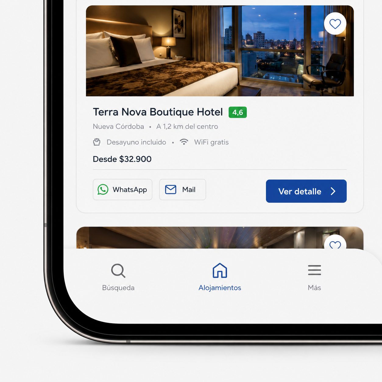
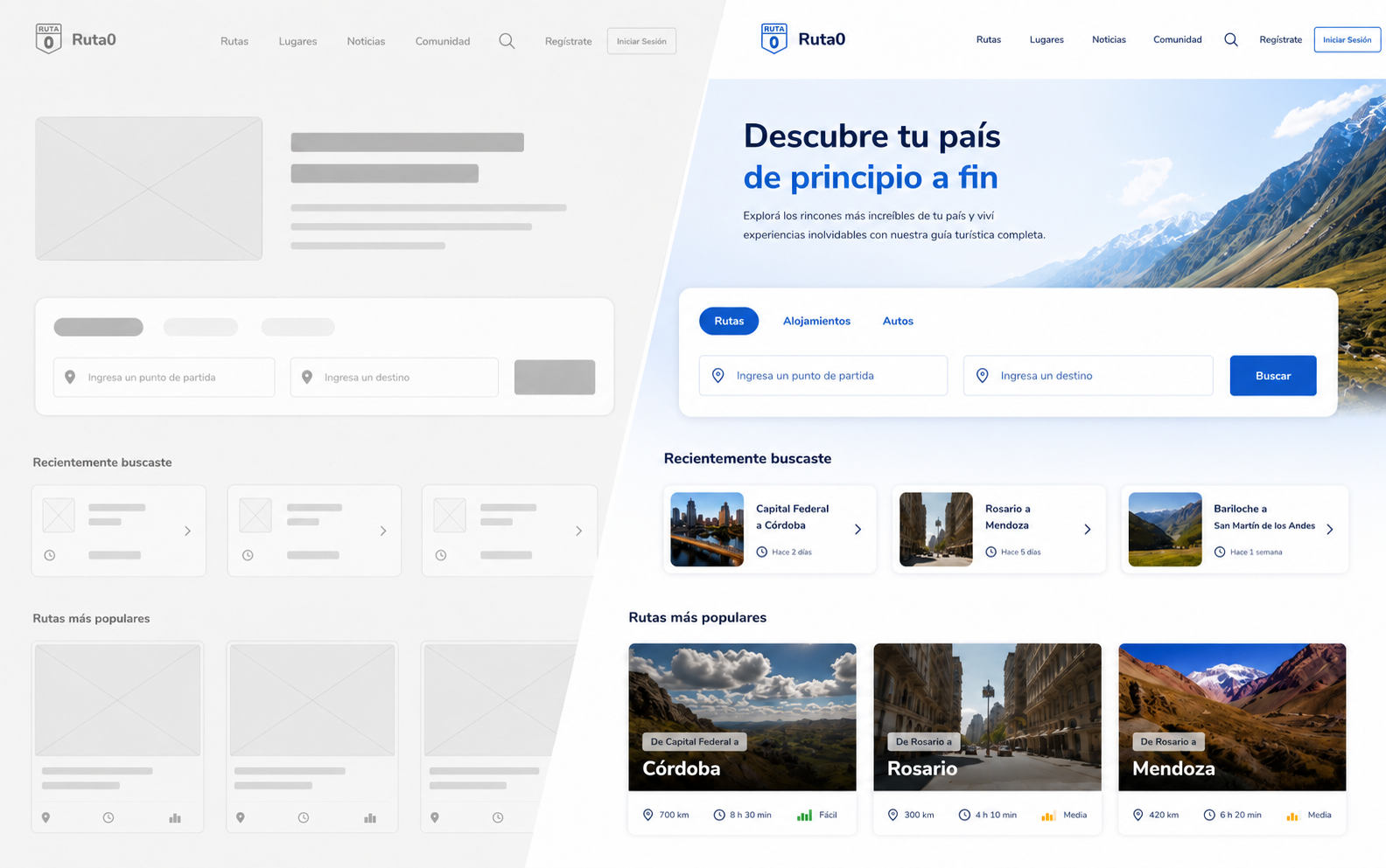
Web experience
The redesigned web interface brings route search, destination discovery and community road alerts into a single coherent layout. Destination pages show accommodation, route options and real-time conditions in one place, reducing the number of clicks between planning intent and actionable information.
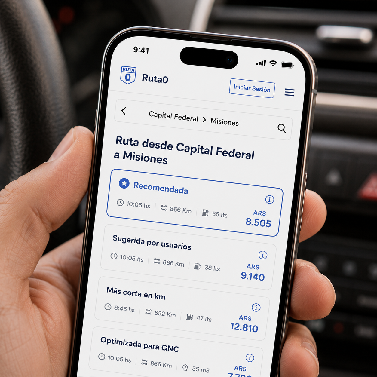
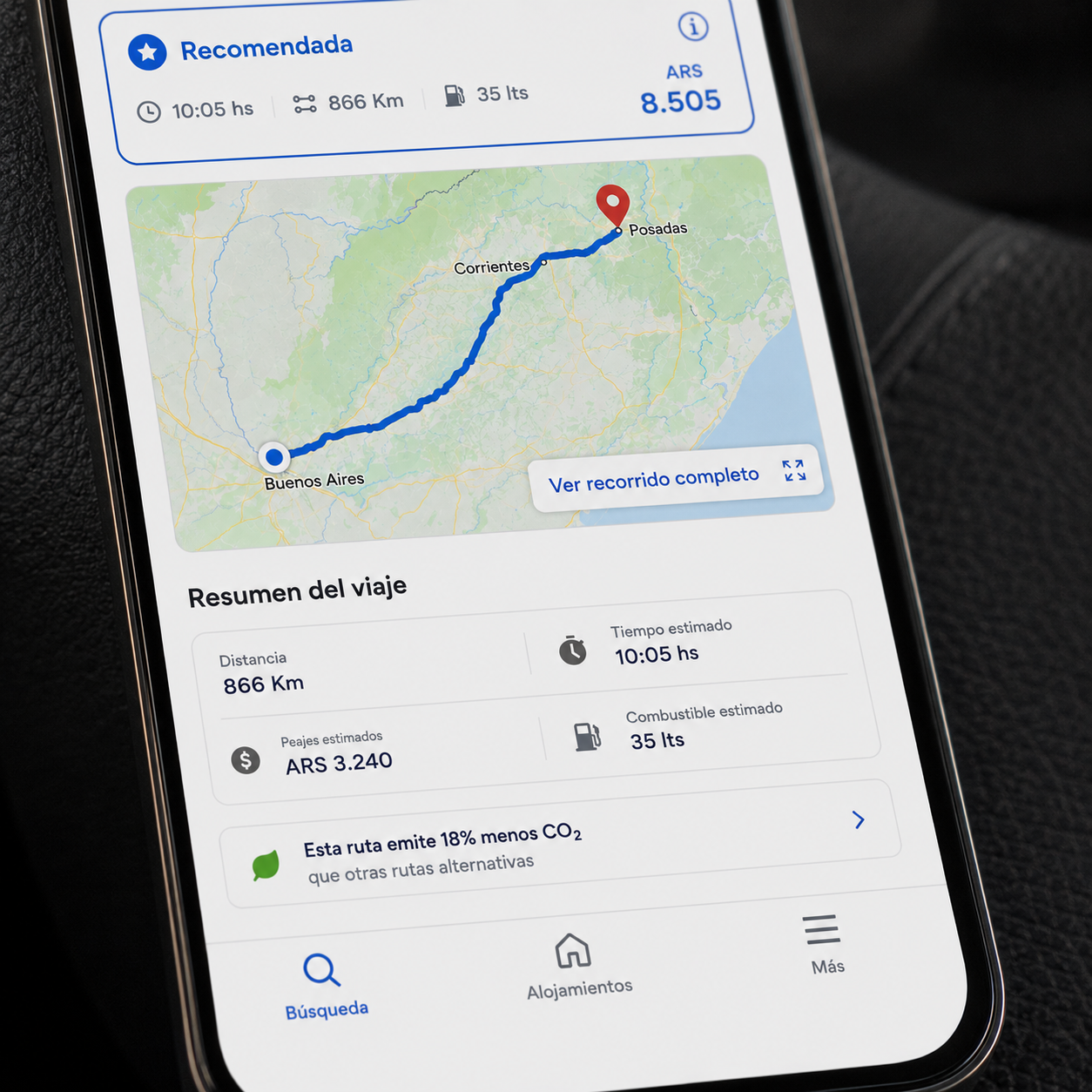
Mobile experience
The mobile redesign is built around the moments that matter most on a road trip: checking if a route is open, finding somewhere to stay in the next town, or pulling up directions without leaving the app. The interface is fast to navigate, works in low-connectivity conditions and keeps the most needed actions within one tap.
Impact
The redesign modernized a platform that had earned deep trust over 25 years, without disrupting the habits of its core audience. Mobile engagement increased significantly and the discovery flow brought new users into parts of the product they had never reached before.
Session and page view metrics reflect changes measured against pre-redesign baselines over a 60-day post-launch window.
Thank you for viewing!