Lending infrastructure that moves at the speed of decisions
Staircase is a B2B fintech platform built for mortgage lenders and brokers, giving teams a single place to manage loan pipelines, track borrower status and close faster. I led the product design of the core operations dashboard and mobile experience, turning high-density financial data into interfaces that loan officers actually want to use.
Staircase gives lending teams a single place to manage their entire pipeline. My job was making dense financial data feel navigable, fast and trustworthy under real operational pressure.
Problems
User interviews with loan officers and operations teams revealed three patterns that were slowing down every deal.
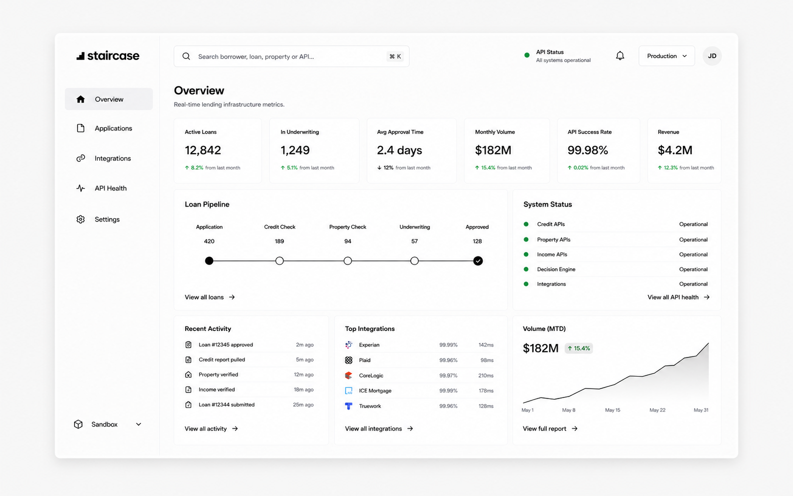
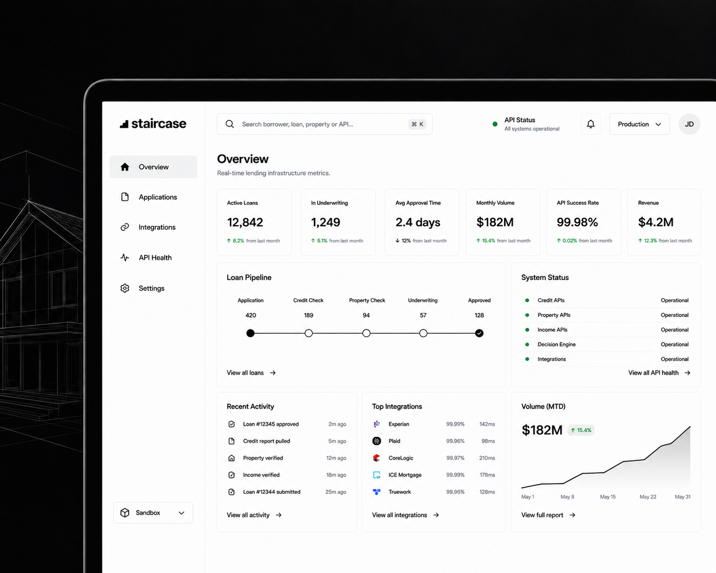
No at-a-glance pipeline view
Key metrics like approval rate, conversion and outstanding volume were scattered across multiple screens. Getting a full picture required navigating away from the work.
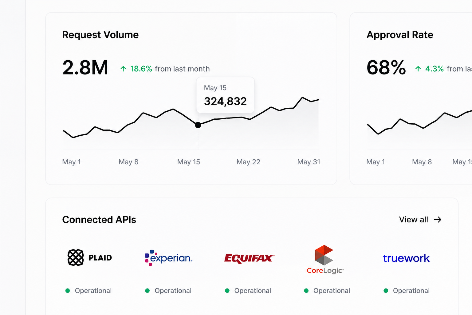
Data without hierarchy
Tables showed everything with equal weight. Critical items that needed immediate action looked identical to routine entries, creating unnecessary scanning load.
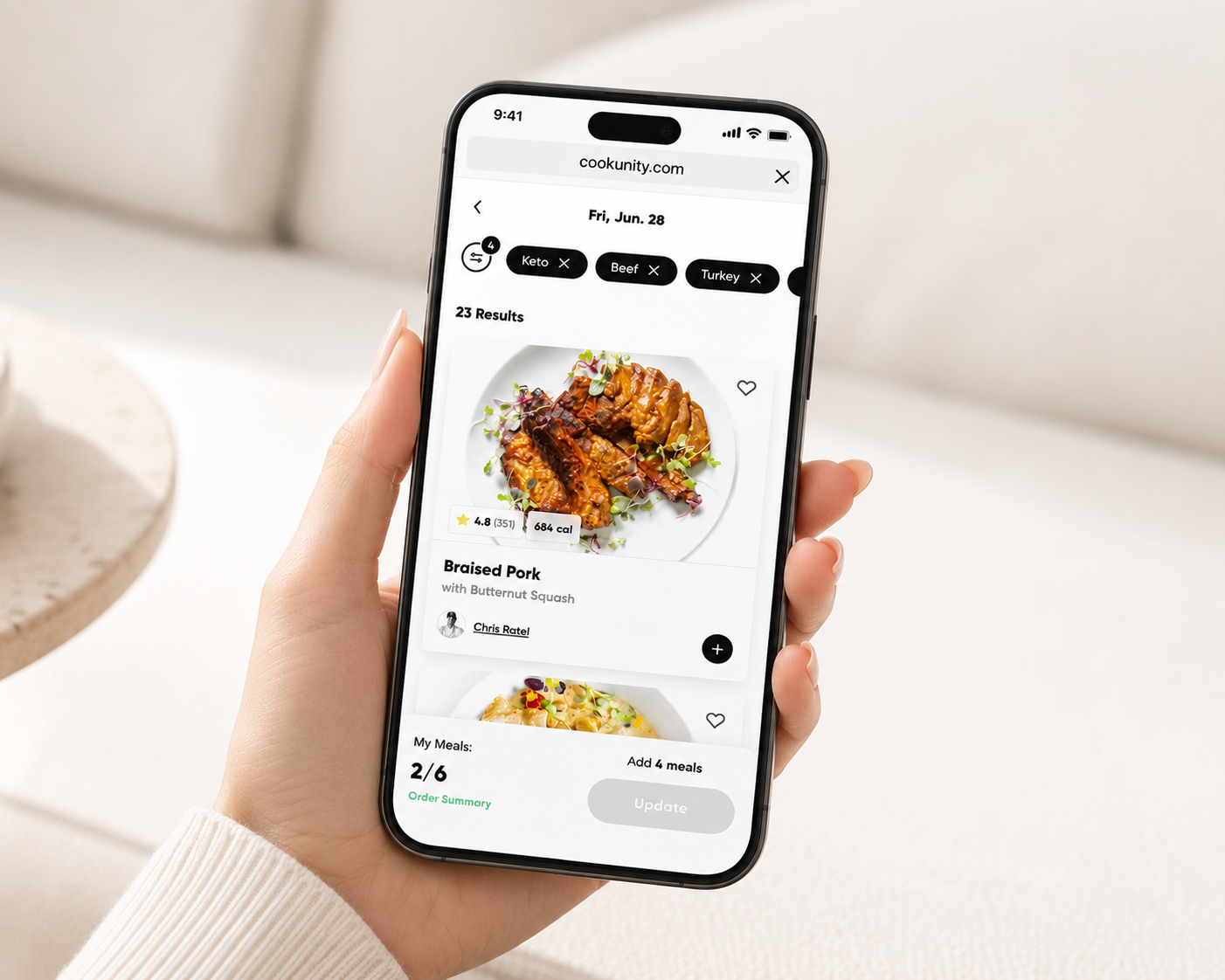
Mobile was an afterthought
Loan officers in the field had no reliable way to check status or respond to alerts. The desktop-first layout broke entirely on smaller screens.
Solutions
Command center dashboard
Redesigned the home screen around a KPI summary bar: request volume, approval rate, conversion and outstanding balance visible at a glance before any scrolling.
Status-driven data tables
Introduced visual status indicators and priority sorting so urgent items surface automatically. Loan officers see what needs action first, not everything at once.
Mobile-first field experience
Built a dedicated mobile view focused on the actions loan officers take in the field: checking loan status, reviewing borrower details and responding to alerts in two taps.
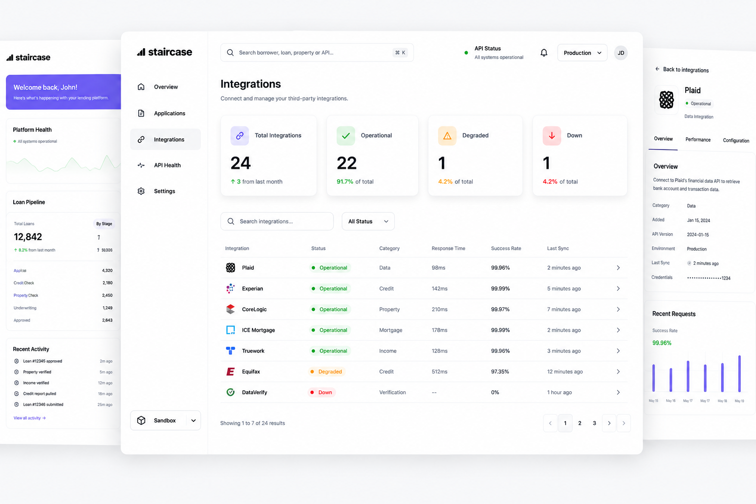
Dashboard & pipeline
The redesigned dashboard leads with the numbers that matter most: total requests, approval rate, conversion and outstanding volume in a persistent summary bar. Below it, the pipeline table uses status color coding and priority sorting so loan officers see what needs attention without hunting through rows of equal-weight data.
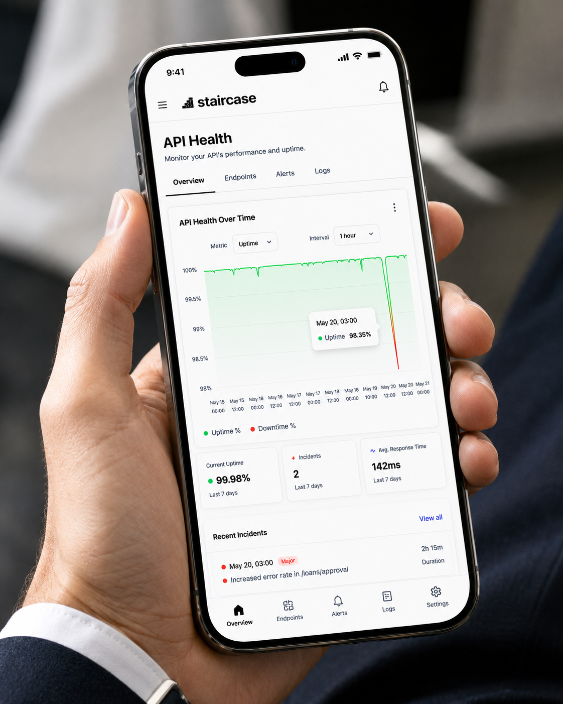
Mobile experience
The mobile view is built around the field use case: a loan officer checking the status of an active deal, reviewing borrower details or responding to a lender alert. The interface strips everything non-essential and organizes actions by urgency, so the most critical task is always reachable in the first screen.
Impact
The redesigned dashboard reduced the time loan officers spent locating pipeline status and eliminated the need to navigate between screens for routine decisions. The mobile experience enabled field use for the first time, expanding the product's footprint beyond the desktop.
Task completion measured via usability testing against the previous interface. Pipeline volume reflects platform scale during the engagement period.
Thank you for viewing!