Finding your mover shouldn’t feel like moving
moveBuddha is one of the largest independent moving marketplaces in the US, helping hundreds of thousands of people compare movers, get quotes and make confident decisions every year. I led the UX/UI redesign of the mover detail pages and quote conversion flow across web and mobile.
moveBuddha helps people navigate one of the most stressful decisions of their lives. My job was making a high-anxiety, high-stakes page feel clear enough to actually convert.
Project goal
The mover detail page is where most visitors either request a quote or leave. It carries review data, pricing context, company credentials, and a call to action that competes with organic phone calls and comparison cards. The goal was to reorganize this information so the right signals land at the right moment, reduce drop-off before the quote CTA, and make the mobile experience feel as trustworthy as the desktop one.
Problems
Heatmaps, session recordings and funnel data pointed to three consistent failure modes across the mover detail pages.
Trust signals buried below the fold
Ratings, review excerpts and company credentials lived too far down the page. Users who needed reassurance left before finding it.
Mobile CTA competition
The quote button and phone number competed for space on small screens, diluting both. The tap target for the primary action was often below the first scroll.
No pricing context near the CTA
Visitors were asked to request a quote without any sense of what they might pay. Anxiety at that moment sent traffic to competitors that showed estimates upfront.
Solutions
Trust above the fold
Restructured the page header to lead with star rating, top review quotes and key credentials before the first scroll. The sticky sidebar reinforced those signals on desktop.
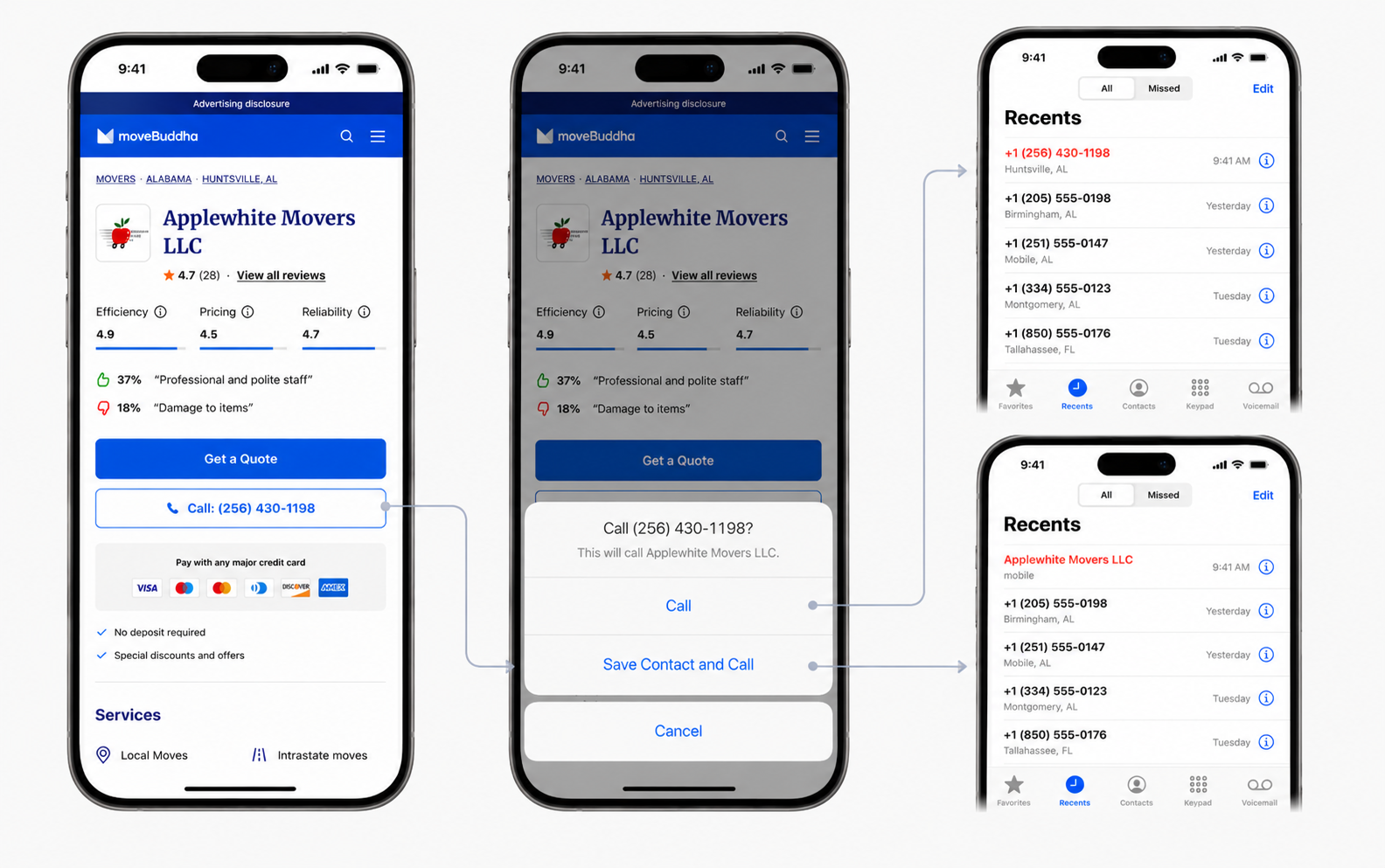
Sticky CTA hierarchy on mobile
Introduced a persistent bottom bar with clear primary and secondary actions. Quote request first, phone call second. Both always within thumb reach.
Pricing context next to the ask
Surfaced the average hourly rate for the state alongside the quote CTA, giving users an anchor before committing. Less anxiety, more clicks.
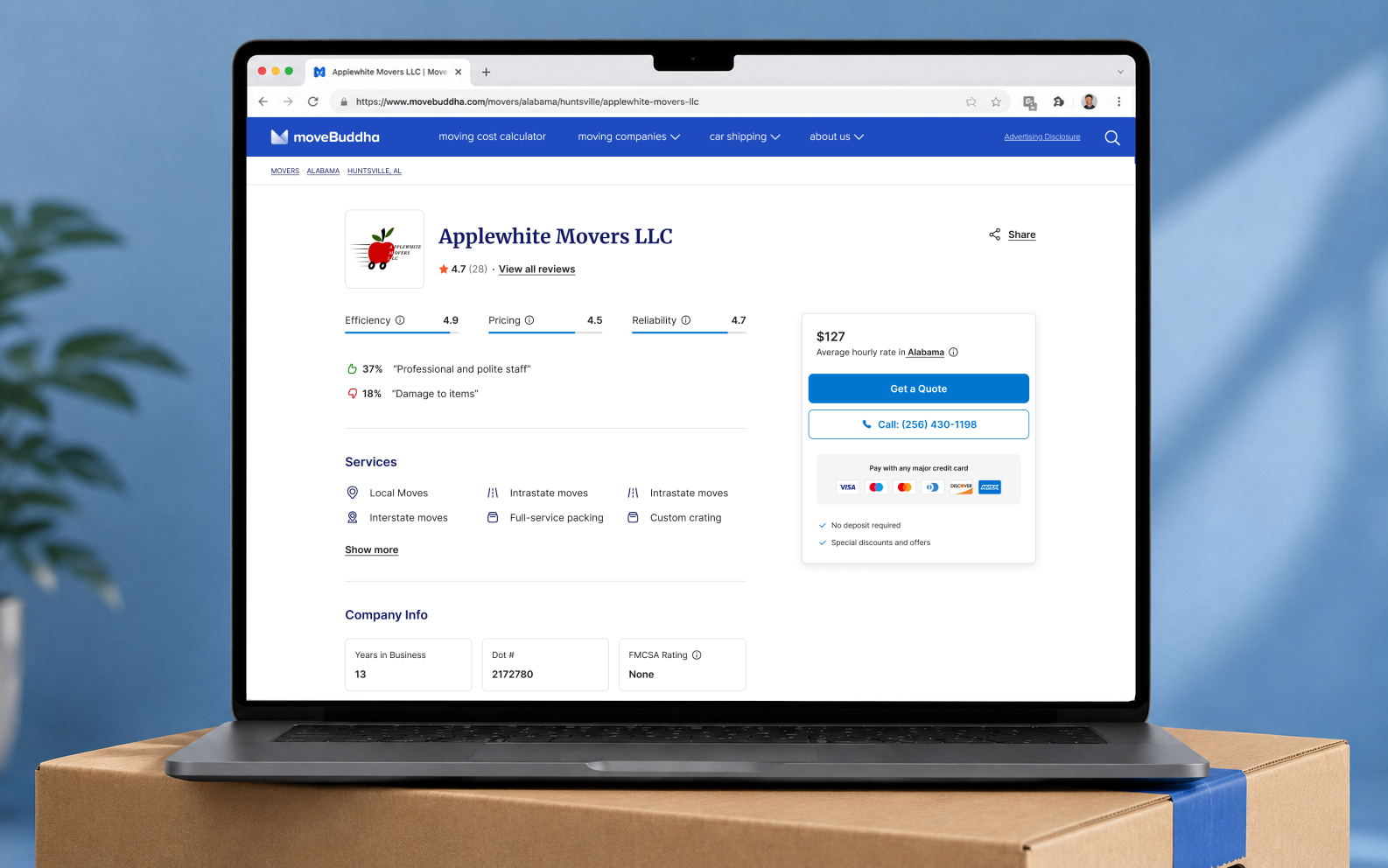
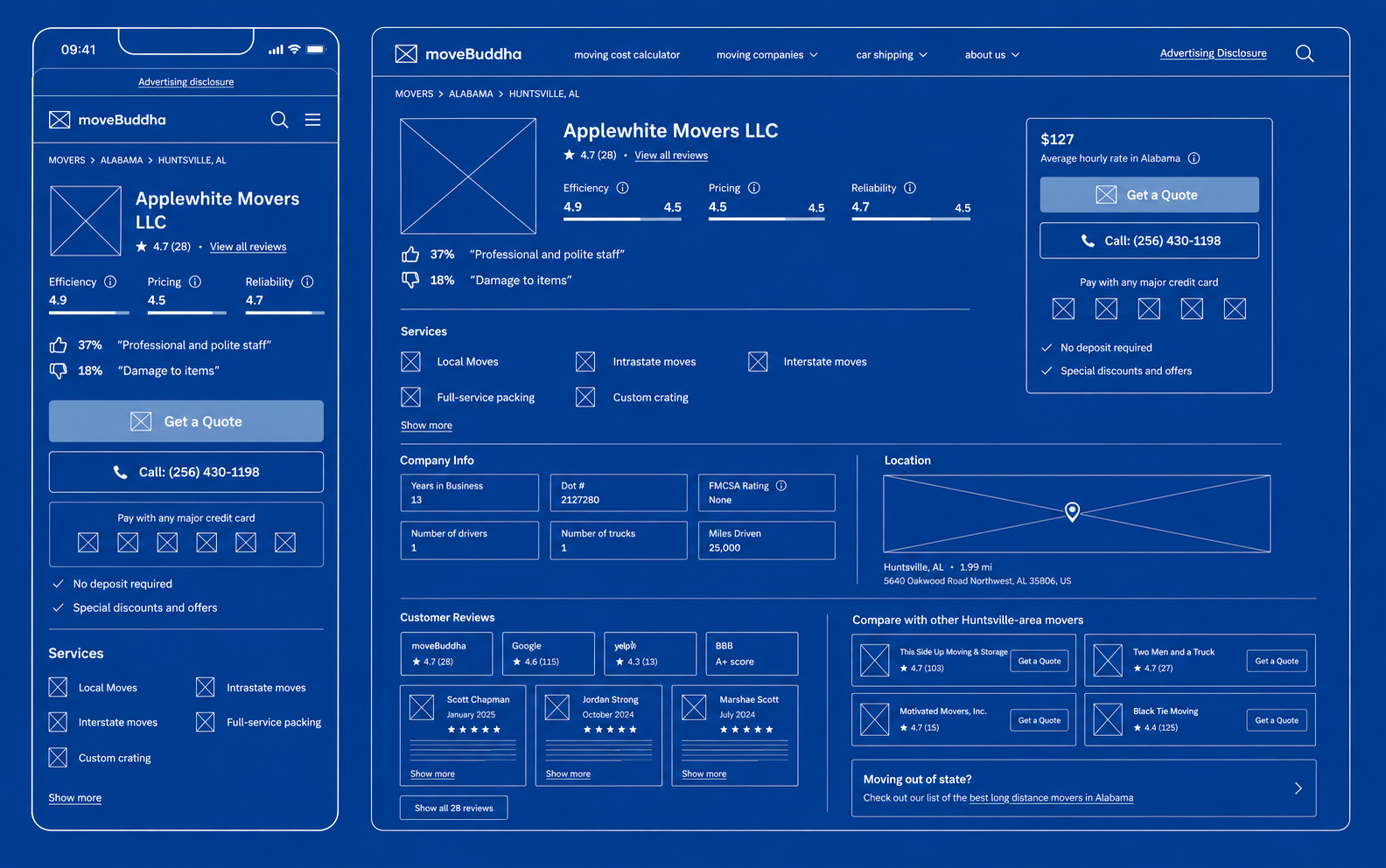
Mover detail page
The redesigned layout leads with trust: rating, sentiment quotes and service list above the fold on both breakpoints. The sticky sidebar on desktop keeps quote and call actions in view through the full scroll, with local pricing context anchored right beside the primary CTA.
Mobile quote flow
On mobile, the persistent bottom bar resolves the CTA hierarchy problem. Tapping the phone number triggers a native action sheet with clear options: call immediately or save the contact first. Both paths are tracked and the second one improved contact save rates meaningfully.
Impact
The redesigned mover detail pages rolled out across the full directory. Quote request rate improved meaningfully on both web and mobile, and the page now ranks as one of the highest-converting entry points in the funnel.
Metrics reflect post-launch performance tracked over a 90-day window. Quote rate and call conversion measured against the previous page variant.
Thank you for viewing!